Background on Two New Paintings

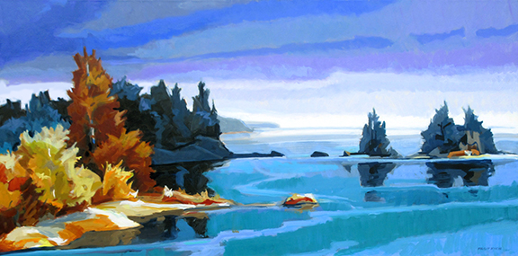
Summer Island, oil on canvas, 20 x 30 inches, 2023 My painting Summer Island is at Somerville Manning Gallery in Greenville, DE. Funny story behind it. Originally I painted a nearby peninsula extending into the waters of a northern lake. The far shore was close by as well and was heavily forested. I liked the result but as I studied the painting I found the most intrigue in the wonderfully irregular rhythms of the peninsula in the foreground. Wanting to give that the star billing I painted on it further and gradually pushed the background farther and farther into the distance. Eventually the distant forests dissolved into peaceful atmospheric blues. Finally the foreground trees seemed to ask to stand alone, so I cut the peninsula off from the shore. The remaining little island seemed happiest with it new untethered status. Kitchen Table, Truro Studio, oil on panel, 18 x 24 inches, 2023 Kitchen Table, Truro Studio is in the new exhibition The Mind's Eye: Turning Inward at Cour